Case study 01
Ocean Crisp
The old identity was busy, inconsistent and lost on the shelf. I stripped it back and rebuilt it to be instantly recognisable and easy to trust.
- Client
- Ocean Crisp, salmon crisps
- Market
- United Arab Emirates
- Delivered
- Logo, stickers, packaging, mockups, animation
- Hired through
- Fiverr
01The brief
The product had real potential. The identity didn’t show it.
01The problem
The old visuals were busy and inconsistent, and the pack had no shelf presence. On a crowded snack aisle, it disappeared.
02The approach
I stripped it back and rebuilt the brand from the ground up: bold, rounded letters with confidence, and a mark that feels friendly.
03The goal
Make the brand instantly recognisable and easy to trust, and design it for real shelves, not just a presentation.
02Concept to clarity
From the first message to the shelf.
The whole journey in my own words, and the steps behind it.
01
A message on Fiverr
Ocean Crisp came to me on Fiverr with a product they believed in and a pack that wasn't working. We started with what a buyer sees first: the shelf.
02
Back to paper
Every direction began as a pencil sketch in my notebook: the letters, the fish, the splash. Only the strongest idea moved to the screen.
03
Drawn letter by letter
In Illustrator the sketch became custom lettering: heavy, rounded letters set tight, so OCEAN CRISP reads as one confident shape.
04
Colour and pattern
A hot crisp red for appetite, a deep ocean blue, and a hand-drawn wave pattern that ties the range together.
05
One pack, three flavours
A single canister design with a colour for each flavour, so the whole range reads at a glance.
06
Ready for launch
Shelf strips, floor stands, hanging signs and a logo animation, mocked up so the client could see the system at every stop, from the screen to the checkout.
03The logo
A fish in the C, a splash for the crunch.
Custom lettering, not a font. Every detail of the logo tells you what is in the pack.

The fish
The C of OCEAN has an eye and a mouth. The sea is inside the name.
The splash
Three strokes beside CRISP read as a splash of water and the snap of a crisp.
The weight
Heavy, rounded letters feel generous and friendly: a snack you want to open, readable from across the aisle.

04Colour and pattern
One red, one blue, and a colour for each flavour.
Two signature colours carry the brand. Each flavour adds its own, so the range stays one family.
Logo red RGB 238, 47, 5The logo colourPattern blue RGB 11, 153, 191The wave patternOriginal Salmon RGB 158, 24, 21FlavourSea Salt RGB 72, 179, 195FlavourSweet Chilli RGB 238, 113, 81Flavour


05Stickers
A sticker for every flavour.
Die-cut box stickers in each flavour’s colour seal the cartons, and travel well beyond them.

Original Salmon

Sea Salt

Sweet Chilli
06Packaging
One canister, three flavours.
The wrap is 280 × 120 mm: the logo, the flavour and the claims on the front, nutrition and ingredients on the back. Choose a flavour to see its wrap laid flat.


Original Salmon. The classic, in a deep red that says rich and savoury.

What the pack says, in the order you read it.
- 01The nameOCEAN CRISP, big, with the line “Flavors deeper than the ocean”.
- 02What it isSALMON CRISPS in a badge, so no one mistakes it for potato.
- 03Why it's betterHigh protein and high in omega 3, pointed at the bowl of crisps.
- 04Which oneThe flavour name, then net weight and protein at the foot.
07Mockups
Mocked up for launch, from the screen to the checkout.
The canister up close, in hand, and at every stop in a supermarket.
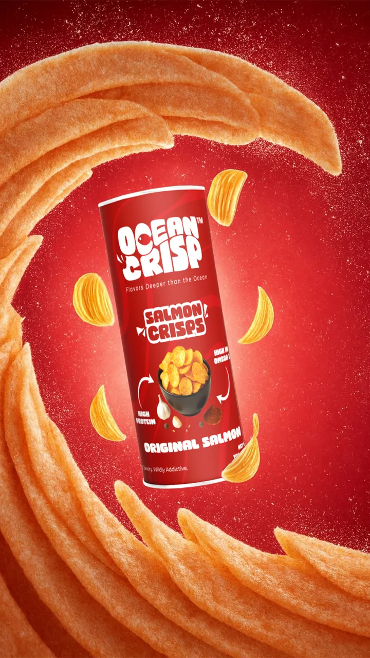
The hero shot: the canister in a swirl of crisps. 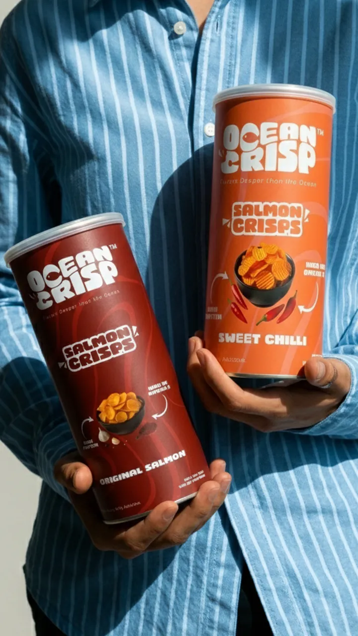
Sweet Chilli and Original Salmon, in hand. 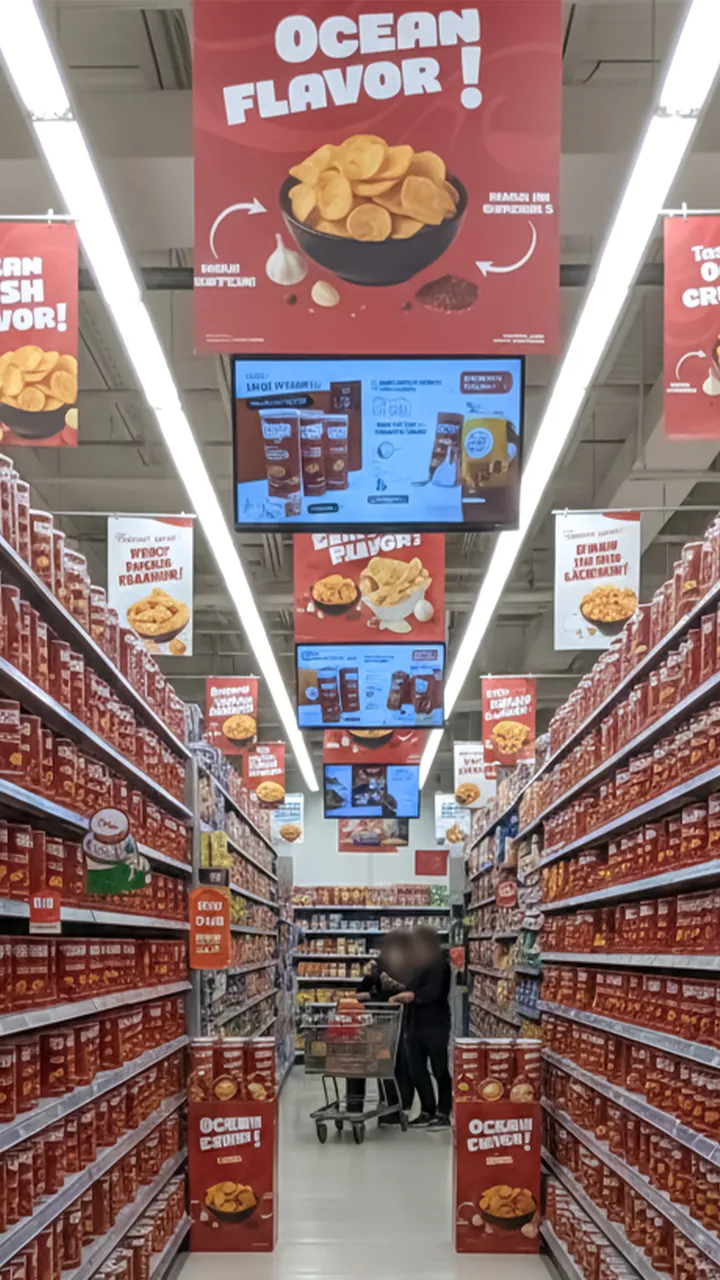
An aisle takeover: hanging signs, screens and shelves. 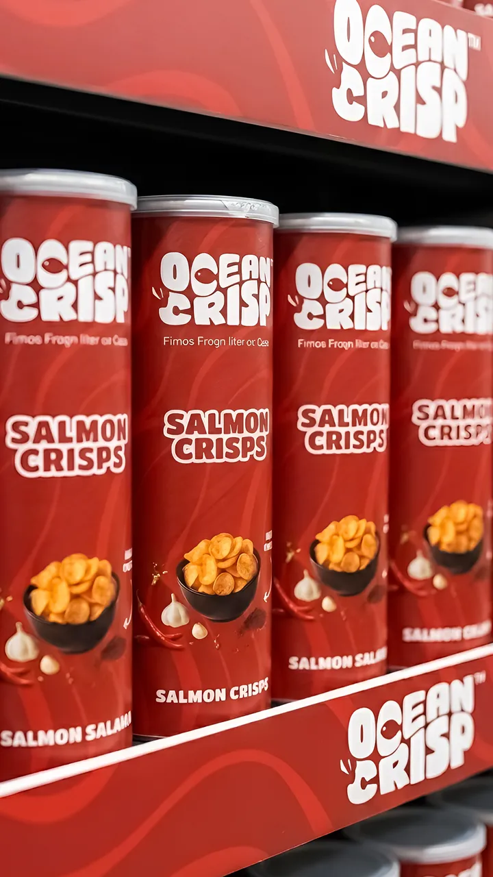
Shelf strips, so the range reads as one block. 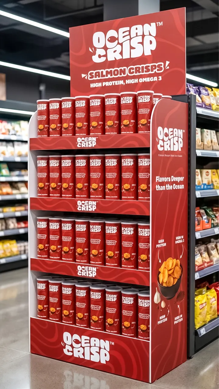
A floor stand for the end of the aisle. The logo animation, cut for stories and reels. 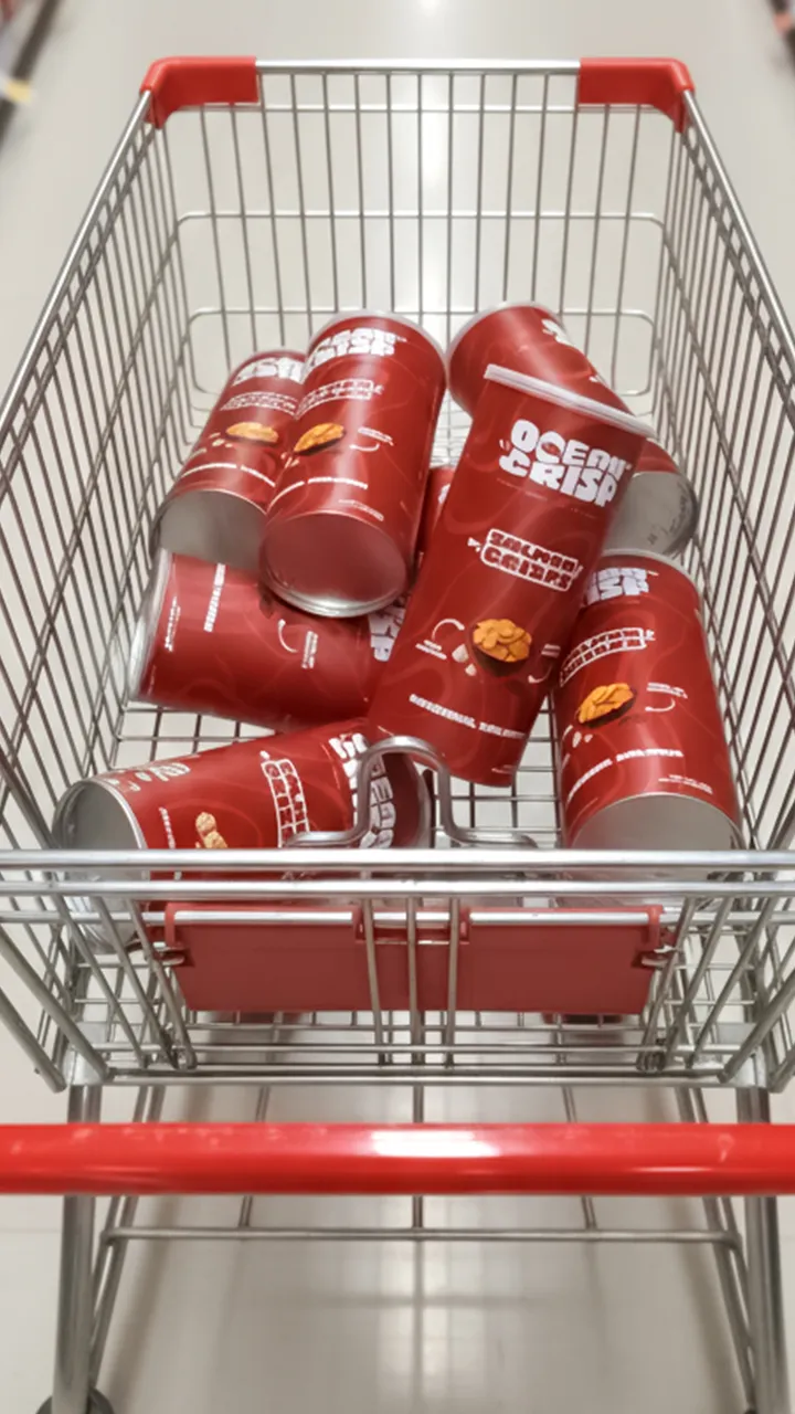
A trolley full of Ocean Crisp. 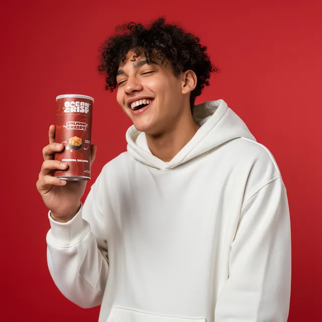
The brand in a lifestyle shot. 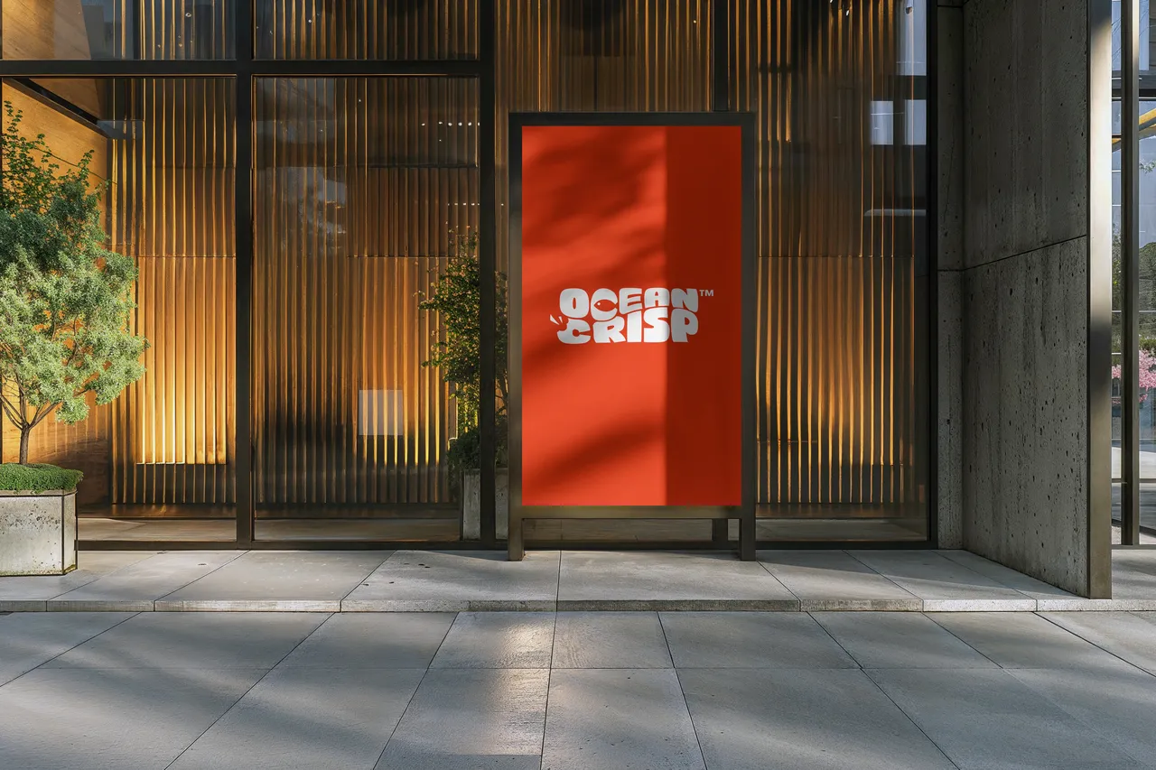
The logo on a shopfront sign.


08Social
“Taste the depth of the ocean.”
Launch posts in the pack’s red and lettering, carrying the client’s own line.


Strong, clean and ready to scale.
Your project next
Want this for your brand?
I take brands from the first sketch to the shelf. Start on Fiverr, or book a call to talk it through first.