Case study 02
Frost
I designed Frost, a frozen yogurt brand, to feel like a cool moment on a warm day: a flowing script, a palette drawn from the cup, and a brand book that keeps every cup and shop the same.
- Brand
- Frost, frozen yogurt
- Line
- “Cooler moments, sweeter memories.”
- Delivered
- Wordmark, logo mark, badges, colour, type, pattern
- Brand book
- 33 pages, logo to mockups

01The brand
More than a frozen treat. A place to slow down.
Frost is fresh, playful and easy to love, for every age. It is built on freshness, quality and taste, and every touchpoint, from the cup to the shop to the feed, is designed to feel like the same cool, cheerful place.
01Fresh
Cool blues and soft light, like the first spoonful.
02Playful
A flowing script and sticker badges that feel drawn by hand.
03Consistent
One book of rules, so every cup, sign and post looks like Frost.
02The wordmark
A script that moves like soft serve.
Custom lettering with a swash underneath: smooth, bold and full of movement, so the name feels like the product.

The F, on its own.
A mark cut from the wordmark for small spaces: app icons, favicons, social profiles, stickers, cups and merchandise.
03Badges
A stamp for cups, bags and feeds.
Round, scalloped and soft-square badges, with the wordmark or the F, for packaging, signage, merchandise and posts.

04Colour
Four colours, each paired with something in the cup.
The brand book sets each colour beside an ingredient: blueberries, frozen yogurt, white chocolate and a blue scoop. Tap a HEX code to copy it.
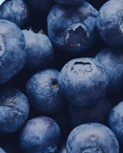
Blueberry RGB 0, 17, 71CMYK 100, 96, 34, 48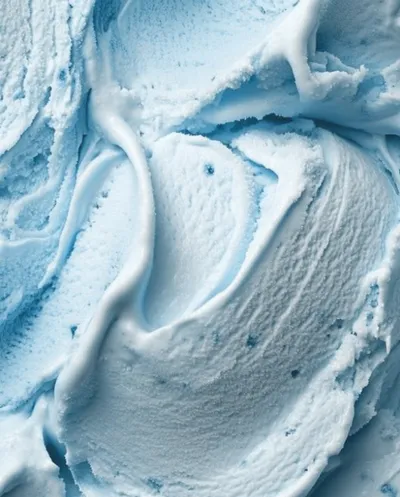
Frozen yogurt RGB 200, 234, 247CMYK 20, 0, 1, 0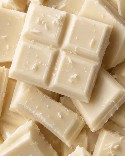
White chocolate RGB 245, 225, 201CMYK 3, 11, 20, 0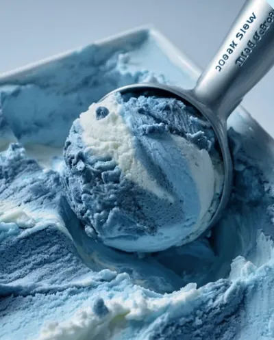
Blue scoop RGB 93, 169, 216CMYK 61, 20, 3, 0


05Typography
A custom script, and a clean sans beside it.
The script is for the name alone. Everything people read, from menus to packaging copy, is set in Libre Franklin.

06Photography
Cool, bright and full of colour.
A direction for every shoot, so the photos feel as much like Frost as the logo does.


07In use
Cups, bags and posts, all from one book.
Mockups of the system at work: cups, a bag, an apron, shop posters and social posts.


Cooler moments, sweeter memories.
Your project next
Want a brand this complete?
I take brands from the first sketch to the shelf. Start on Fiverr, or book a call to talk it through first.